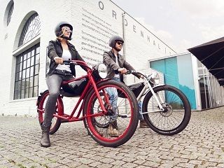
Great E-Bike Designs Are Not All Trendy

No surprise: the concept comes from The Netherlands. Along with the Germans and the Italians, the Dutch have really dialed into the future of e-bikes—at least so says my colleague Brian Nordwall, owner of Seattle E-bikes. And he should know; he operates America’s most successful store in this market. It’s actually more a “destination” than a store per se; people come from all over the northwestern U.S. and southwestern Canada to learn about this exploding new arena, come face-to-face with the very newest and best products, and talk with his expert staffers.
For good reason, Brian spends a ton of time in Europe, getting his fingers firmly on the pulse of where all this is going. He points out that in the U.S., less than 1/10th of 1% of all bicycles sold are electric, where in Amsterdam, it’s 37%. Yet all this is changing very rapidly.

They look like a hybrid of a motorbike and a push bike!